Broad Strokes to Fine Lines - moving between high and low fidelity design
Oct 15, 2023
Broad Strokes to Fine Lines - moving between high and low fidelity design
Oct 15, 2023
Broad Strokes to Fine Lines - moving between high and low fidelity design
Oct 15, 2023
When embarking on a new design project, it's tempting to dive straight into the details. Put the headphones on, jump straight into our favourite tool, and start crafting that perfect UI.
In recent years, design tools like Figma have become the darlings of the design community, offering an easy segue into hi-fidelity design. And these days, with robust design systems at our fingertips, moving into hi-fidelity design seems like a faster, more efficient step. Creating beautiful, polished UIs is no longer a long, arduous journey but a swift, accessible venture.
But, as a result, inexperienced designers often jump straight into hi-fidelity designs that may look amazing, but don't come close to solving a user's problem. This phenomenon, famously coined "the dribbblisation of design" by intercom 10 years ago, has only gotten worse.
Seasoned designers know the irreplaceable value of starting with lo-fidelity designs, and resisting the urge to move into polished UI too early in a project.
So let's talk about how we can best navigate between low and high-fidelity in product design, and avoid an early departure from the lo-fi stage.
Broad Strokes: Embracing Low Fidelity design
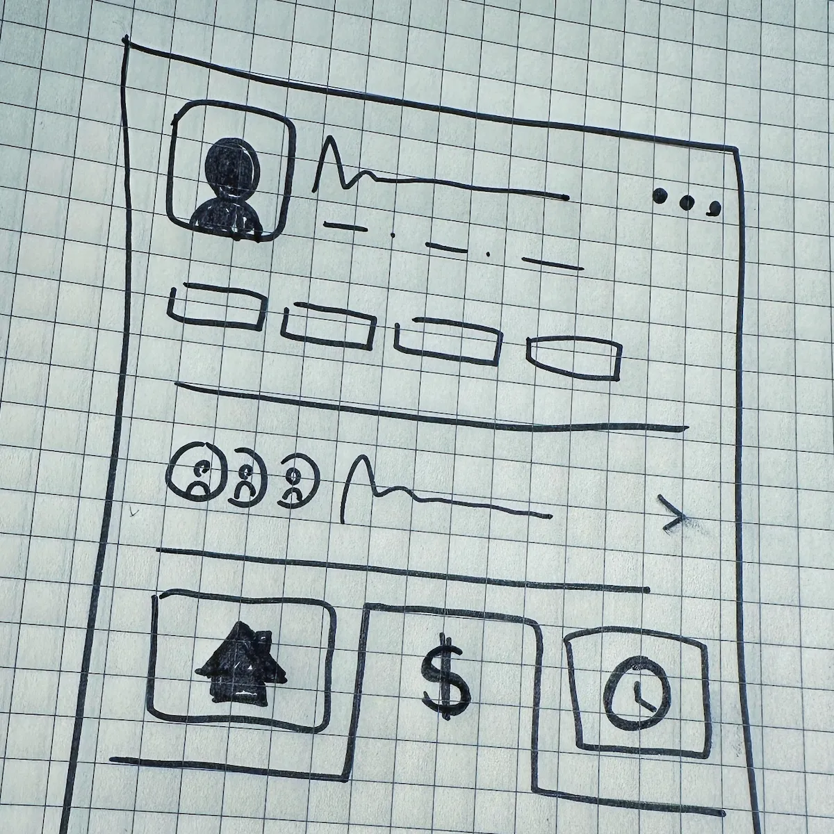
Lo-fidelity design isn't just about producing rough sketches and wireframes. It's about doing the foundational work that's crucial to understanding the problem space, before jumping into solution mode.
I'd consider the following tasks part of the "Low-fidelity" phase:
- Mapping out the users journey
- Drawing diagrams to help you (and your stakeholders) understand and visualise the problem space
- Understanding the information architecture of your product, and the 'Objects' that match your user's mental model
- Defining the hierarchy of each view, and the navigation between each view
- Broad-stroke, happy path sketches of your product (also known as fat-marker sketches)
The beauty of this phase is that nothing feels finished (and it isn't!). Low fidelity designs encourage a free flow of feedback, partly because they come across as works in progress. The crude, unfinished look of lo-fidelity artefacts invites your team and your users to provide honest, unreserved feedback - meaning that you can explore new ideas, and elicit better feedback.
By contrast - stakeholders that are presented with hi-fidelity designs can be more hesitant in providing foundational or structural feedback. The design 'looks finished', leading to a reluctance to provide the feedback that they really want to give.
When to Switch Gears?
Mastering the transition between lo-fidelity and hi-fidelity design lies in recognizing the signs of when to switch gears. Here are some cues to consider:
1. Validation of Core Concepts:
Have the core concepts, scope and functionality been validated through feedback in the lo-fidelity stage? If the answer is yes, it’s a green signal towards hi-fidelity.
2. Clarity in the User's Journey
Is the user journey well-understood and mapped out? Hi-fidelity will be the stage to fine-tune this journey, and get into the edge cases.
3. Stakeholder Consensus
Is there a consensus among stakeholders on the foundational design? A 'yes' here is a nod towards transitioning to hi-fidelity.
On the flip side, there's no reason why you can't transition from low to high-fidelity, and then go back again. Discovering major functionality issues or foundational cracks during the hi-fideltiy stage might warrant a step back into the lo-fidelity realm. This back-and-forth isn't a setback, but a prudent step to refine and revalidate the design.
Conclusion
The transition between low and high fidelity design is a crucial phase of the design process.
Lo-fidelity design allows for robust exploration and feedback gathering, to form a solid foundation. Hi-fidelity design, on the other hand, adds the fine lines to the broad strokes. This is where design ideas are refined, validated, and polished.
In today's world, and with today's tools, it's tempting to jump straight into hi-fideilty designs that look sharp on your portfolio. However, rushing through or skipping the lo-fidelity stage often leads to overlooked usability issues or missed opportunities for more innovative solutions.
As you approach your next design project, remember the importance of starting with lo-fidelity, and staying there as long as you can. Only move to hi-fidelity prototypes when you're ready, and be willing to step back if necessary.
When embarking on a new design project, it's tempting to dive straight into the details. Put the headphones on, jump straight into our favourite tool, and start crafting that perfect UI.
In recent years, design tools like Figma have become the darlings of the design community, offering an easy segue into hi-fidelity design. And these days, with robust design systems at our fingertips, moving into hi-fidelity design seems like a faster, more efficient step. Creating beautiful, polished UIs is no longer a long, arduous journey but a swift, accessible venture.
But, as a result, inexperienced designers often jump straight into hi-fidelity designs that may look amazing, but don't come close to solving a user's problem. This phenomenon, famously coined "the dribbblisation of design" by intercom 10 years ago, has only gotten worse.
Seasoned designers know the irreplaceable value of starting with lo-fidelity designs, and resisting the urge to move into polished UI too early in a project.
So let's talk about how we can best navigate between low and high-fidelity in product design, and avoid an early departure from the lo-fi stage.
Broad Strokes: Embracing Low Fidelity design
Lo-fidelity design isn't just about producing rough sketches and wireframes. It's about doing the foundational work that's crucial to understanding the problem space, before jumping into solution mode.
I'd consider the following tasks part of the "Low-fidelity" phase:
- Mapping out the users journey
- Drawing diagrams to help you (and your stakeholders) understand and visualise the problem space
- Understanding the information architecture of your product, and the 'Objects' that match your user's mental model
- Defining the hierarchy of each view, and the navigation between each view
- Broad-stroke, happy path sketches of your product (also known as fat-marker sketches)
The beauty of this phase is that nothing feels finished (and it isn't!). Low fidelity designs encourage a free flow of feedback, partly because they come across as works in progress. The crude, unfinished look of lo-fidelity artefacts invites your team and your users to provide honest, unreserved feedback - meaning that you can explore new ideas, and elicit better feedback.
By contrast - stakeholders that are presented with hi-fidelity designs can be more hesitant in providing foundational or structural feedback. The design 'looks finished', leading to a reluctance to provide the feedback that they really want to give.
When to Switch Gears?
Mastering the transition between lo-fidelity and hi-fidelity design lies in recognizing the signs of when to switch gears. Here are some cues to consider:
1. Validation of Core Concepts:
Have the core concepts, scope and functionality been validated through feedback in the lo-fidelity stage? If the answer is yes, it’s a green signal towards hi-fidelity.
2. Clarity in the User's Journey
Is the user journey well-understood and mapped out? Hi-fidelity will be the stage to fine-tune this journey, and get into the edge cases.
3. Stakeholder Consensus
Is there a consensus among stakeholders on the foundational design? A 'yes' here is a nod towards transitioning to hi-fidelity.
On the flip side, there's no reason why you can't transition from low to high-fidelity, and then go back again. Discovering major functionality issues or foundational cracks during the hi-fideltiy stage might warrant a step back into the lo-fidelity realm. This back-and-forth isn't a setback, but a prudent step to refine and revalidate the design.
Conclusion
The transition between low and high fidelity design is a crucial phase of the design process.
Lo-fidelity design allows for robust exploration and feedback gathering, to form a solid foundation. Hi-fidelity design, on the other hand, adds the fine lines to the broad strokes. This is where design ideas are refined, validated, and polished.
In today's world, and with today's tools, it's tempting to jump straight into hi-fideilty designs that look sharp on your portfolio. However, rushing through or skipping the lo-fidelity stage often leads to overlooked usability issues or missed opportunities for more innovative solutions.
As you approach your next design project, remember the importance of starting with lo-fidelity, and staying there as long as you can. Only move to hi-fidelity prototypes when you're ready, and be willing to step back if necessary.